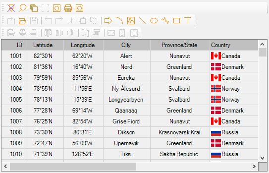
MegaGrid .NET WinForms Control is a versatile, feature-rich, and easy-to-use grid control for the .NET platform, and it allows developers to virtually control every aspect of populating data in the grid. It features 2 essential modes - readonly and edit mode, and you can leverage them to make the most of it and effortlessly meet your project requirements.
1: In Row Editing
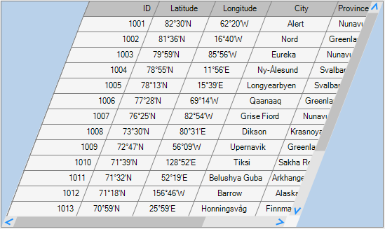
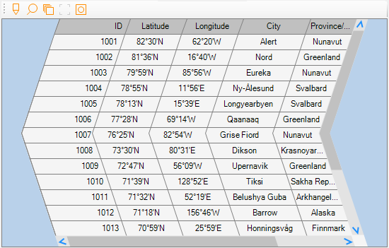
2: Quadrilateral Layout
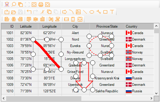
3: Arrow Layout
4: Curved Layout
5: Editing in Edit Panel
6: Edit Mode with Sections
7: Batch Editing
8: Readonly Mode
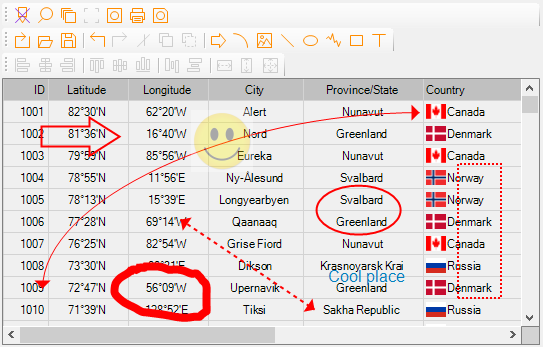
9: Annotation
10: Cascaded Sub Grids
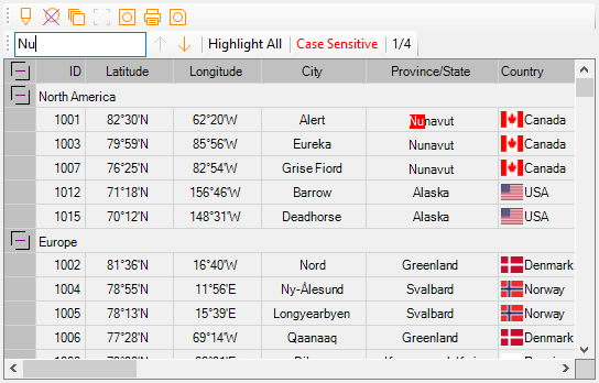
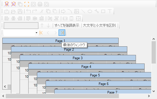
11: Search Grid
12: Localization with 50+ Languages
A few quick facts are listed below:
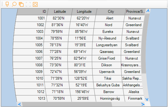
1.A non-databound grid that can be used to populate any structured, semi-structured, or unstructured data - either Small or Big.
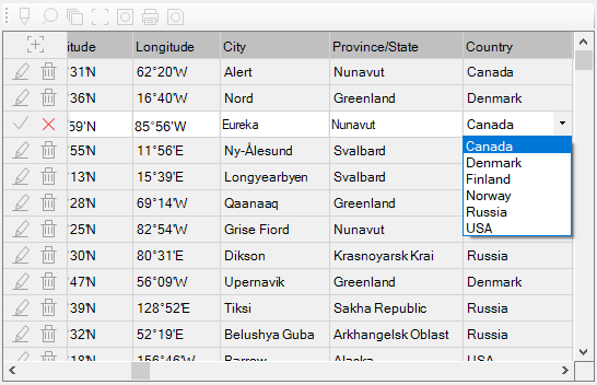
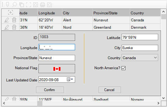
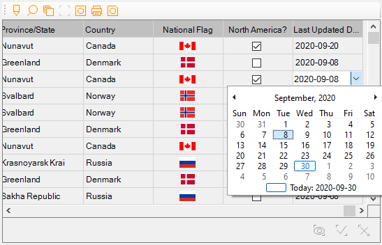
2.Edit mode provides 5 options - in row, edit panel, edit panel and show row, popup window, and batch - which are powered by CheckBox, ComboBox, DateTimePicker, MaskedTextBox, NumericUpDown, PictureBox, RichTextBox, and TextBox.
3.Industry's 1st grid control with WYSIWYG annotating feature backed by 8 different tools - arrow, curve, image, line, oval, paint brush, rectangle, and text.
4.Industry's 1st grid control with cascaded sub grids.
5.Industry's 1st grid control with non-rectangle layouts - quadrilateral, curve, and arrow.
6.Non-rectangle scrollbars
7.Search the grid - highlight all and match case.
8.Unrivaled 50+ languages for localization.
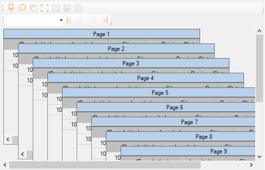
9.Copy screenshot to clipboard.
10. Print and save screenshot.
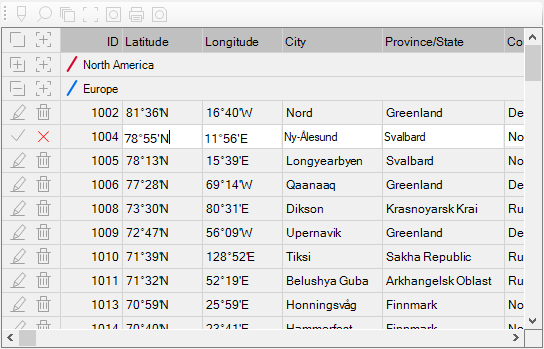
11. Categorize the rows into different sections and group columns.
12. Display an arrow to indicate scroll bar's orientation - horizontal or vertical scroll bar.
13. Multiple trendy checkbox styles - 19 in total.
14. 8 different alignment options per cell for combined text(s) and image.
15. Up to 4 lines of texts per cell.
16. Configurable settings including background color, text color, font, section icon, row heights, column widths, sorting columns, resizing rows and columns, moving columns, shading alternate rows, linked texts, and etc.
During annotating process, multiple objects can be selected via SHIFT key and mouse clicking, and the following grid operations are disabled.
1.Select cell(s) or row(s).
2.Edit mode.
3.Move and resize columns.
4.Sort a column.
5.Click checkboxes if applicable.
6.Expand or collapse sections if applicable.
Since the bounds of a paint brush object are determined by its path, once it is done, it can't be resized. Also it can't get involved in being made same width, height, or size with other objects. However you can still drag and move it, change color, line width and type.